
Desertcart purchases this item on your behalf and handles shipping, customs, and support to Morocco.
🎨 Elevate your palette with Japan’s iconic color secrets — don’t just create, captivate!
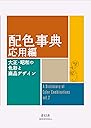
A Dictionary of Color Combinations Volume 2 is a revered design reference featuring 237 meticulously curated color palettes rooted in Japanese seasonal themes and early 20th-century aesthetics. With 172 removable color chips and bilingual naming, it offers a tactile, culturally rich resource for designers, artists, and creatives seeking authentic inspiration from the legendary Sanzo Wada, an Academy Award-winning color expert.
| Customer Reviews | 4.8 out of 5 stars 1,605 Reviews |
E**E
Great historical color theory reference.
Such a wonderful little book! Five stars for content and historical/design interest. 'The Man Behind the Viral Color Dictionary' by Bungu was what made me buy one of these. But these 'color dictionaries' go back hundreds of years. I bought it because my father had that 1930's color sense, and I wanted it to remember how he dressed, but it really is lovely and entertaining overall. I bought Vol 2 over Vol 1 because 1) Japanese colors are named after seasons and natural phenomena, so I thought this might have some additional intellectual clout (I like that sort of thing) and 2) I figured while this book has fewer combinations, the combinations have more colors 3-7 color combinations), so I could only use "part" of a combination and the combination still "works" (I just put my finger over the colors I don't like or or don't want to use and 'voila!'). So, here is the "bad stuff" - the cover is the same paper as the book pages, with a thinner paper slip cover, so the spine if pretty lightweight. Overtime, I'll probably lose pages, so you'll want to handle it pretty gingerly. Also, the colors are pretty off in the printing. If you look up the hex codes to the colors (which are available online) and then match it to the closest house paint they are not nearly so saturated. For example, I looked up one of the yellows and it was actually an off white. Anyhow, if you like color theory, or design it's worth a peek. I don't own enough clothes, or in a variety of enough colors for this to be useful in my closet - - but I might select my house colors with it. In the photo look at that Sulphur yellow in the center. The Royal Silk is the closest hex code paint I can find. There is some wiggle room with all these shades; and the book still "works" as a guide.
D**O
Awesome for inspiration!
This is an awesome little coffee table book. The color combos are great for inspiration! I have them both. 10/10 would recommend
J**E
Classic, a must-have for designers
Beautiful book to simply peruse or to use for any color combining project you may have. Compact and well-printed. Bought both volumes.
G**N
Like the other one (Vol 1) but different (Vol 2) with more.
Volume 2 continues the great color combinations of the 1st Volume, but the combinations are more complex, with more colors. There's even a section of art in the form of paintings, prints, woven work, etc. that you see on one page while on the opposite page is the breakdown of the colorations in bars with no image. What this does is show how the art works, and then how the combinations also work. Also more of the simplified 2 and 3 combinations that I think I prefer as more minimal. Again, these are ranged from light and airy to darkly saturated -and all curiously satisfying and worth study and trying them out. On the computer it's possible to match any tone or hue, so there's a path that only requires finding the right starting color then paying attention to the combination. Not that it's an end-all, but a beginning. Any of those can be shifted or modified with ease but it depends on how they fit a real-time application and not a formula. But the horizons have already been expanded so there's more, and even more.
A**Z
Use colors confidently
I bought this book to improve my understanding of color combinations, and it has exceeded my expectations. The images are clear, the examples are inspiring, and it’s easy to apply in your dairy rutine. Whether you’re a beginner or have some design experience, this is a great resource to keep on hand. I highly recommend it.
P**S
I like the contents of the book, but partially disappointed with the quality
The extra paper cover is very frustrating to hold so I took it off entirely, the pages themselves are rather thin considering the whole book is about color. In the attached image, you can see the outline of the graphics on the next page. This is really only a problem for the lighter colors. The papers are bound a little too tight, so many images crest into the binding, I'm holding the page open pretty hard. The book is interesting and a good guide if you're designing just about anything. I enjoyed the little biography at the beginning and the CMYK color codes at the end if you want to use any of the colors seen in the book. Additionally this listing is definitely overpriced. If you switch over to Amazon Japan, and are ok waiting some extra time, you can get the book almost at half the price listed here. Pretty disappointed to find that out after scanning the qr code in the book.
R**E
If you work with colors this is a n excellent book
Great pocket size book for artists, fashion designers, interior decorators, house painters, architects, anyone working with colors.
S**M
Many surprises of color combinations in this little book.
Very interesting color combinations, I use it to get ideas for watercolor painting.
S**L
Cep kitap boyunda
Sorunsuz şekilde teslim edildi ilk kitabı istediğim halde o teslim edilemedi
C**N
Une référence incontournable pour tous ceux qui travaillent avec les couleurs
Les deux volumes forment un duo complémentaire indispensable. Chaque planche présente des combinaisons de couleurs avec leurs codes — une source d'inspiration directe pour le design, la déco ou l'impression. L'ouvrage japonais original est traduit avec soin, la qualité d'impression est au niveau. Un outil que l'on consulte régulièrement plutôt qu'on ne le lit d'un trait. Expédition rapide, livraison soignée. Un achat que je ne regrette absolument pas.
G**E
Interressant bij schilderen
Leuke kleure'combinaties
W**O
Inapiring
What a beautiful second edition account of colours and the way they may be presented in every day objects and materials. A truly remarkable set of combinations in a sort of manifest any sort of artist or designer in any single capacity could find useful, interesting, or at minimum, inspiring. Highly recommend this and the first edition.
A**A
Dieses kleine Buch lohnt sich wirklich
Lange habe ich überlegt und mich dann doch entschieden, dieses Buch zu bestellen. Ich zeichne und male viel mit den unterschiedlichsten Materialien. Farbharmonien zu finden, ist für mich eine Herausforderung und so richtig zufrieden bin ich oft nicht. Schon länger benutze ich Bücher und Kartendecks zu diesem Zweck, aber so richtig überzeugt hat mich bisher keins. Also habe ich dann dieses auch noch gekauft. Das Buch hat ein handliches Format von 15x11 cm und bietet auf 336 Seiten viele Farbkombinationen. Nach einer Einführung auf japanisch und englisch folgen unzählige Kombinationsbeispiele von 3-7 kombinierten Farbtönen. Teilweise sind Bilder und Muster daneben. Unter oder neben den Farben stehen Farbbezeichnungen auf japanisch und englisch, die auch auf den letzten Seiten noch einmal farblich sortiert angeordnet sind. Darauf folgen Farbblätter mit einem Farbstreifen der 5-fach unterteilt ist (siehe Foto), den man auch zum Beispiel abschneiden und aufkleben könnte, um eine Lieblingskombination zu hinterlegen. Das ist praktisch, um meine eigenen Farbmuster direkt daneben zu halten, um die passende Farbe heraus zu suchen. So verwende ich die Seiten im Alltag und finde es einfach genial, weil das eine richtige Hilfe für mich darstellt, schnell und einfach genau den passenden Farbton zu finden, sei es bei Aquarell-, Acryl-, Marker- oder Buntstiftfarben. Die Farbkombinationen sind abwechslungsreich, modern und regen dazu an, neue Farbkreationen zu entdecken. Obwohl ich kein japanisch spreche und auch den englischen Text nicht gelesen habe, kann ich das Buch optimal nutzen, weil es selbst erklärend ist und ich es so verwende, wie es für mich am besten passt. Auf meinen Fotos unten ist eine Kombinationsvariante zu sehen und eine Farbe daraus auf dem Farbstreifen mit einem Buntstiftmuster meiner eigenen Farben. Ich hoffe, das man so erkennen kann, was ich versucht habe zu beschreiben. Wer auf der Suche nach stimmigen, interessanten und abwechslungsreichen Farbzusammenstellungen ist, weiß das Buch bestimmt bald zu schätzen, so wie ich. Geeignet finde ich es zum Malen, Dekorieren und für modische Accessoires und vieles mehr.
Trustpilot
1 day ago
3 weeks ago