

Full description not available
J**E
Amazing Book
This book contains an incredible amount of detail on 19th Century totalitarian states. Great depth of research and a well spring of engaging imagery bring the content to life. This is definitely worth the price.
R**N
The look of total control
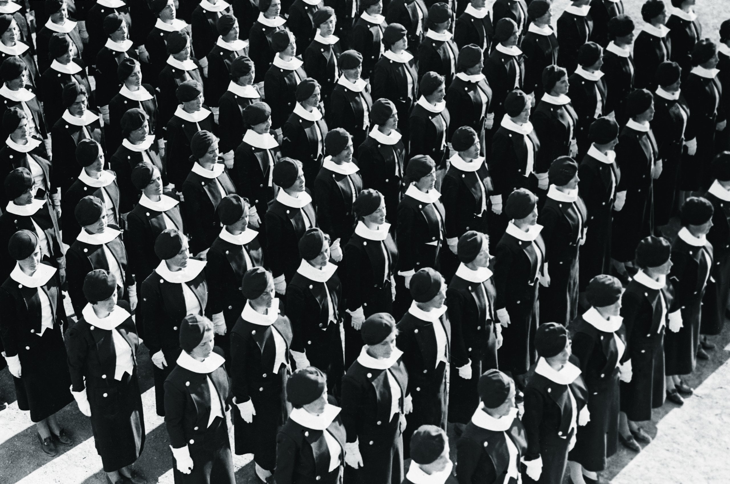
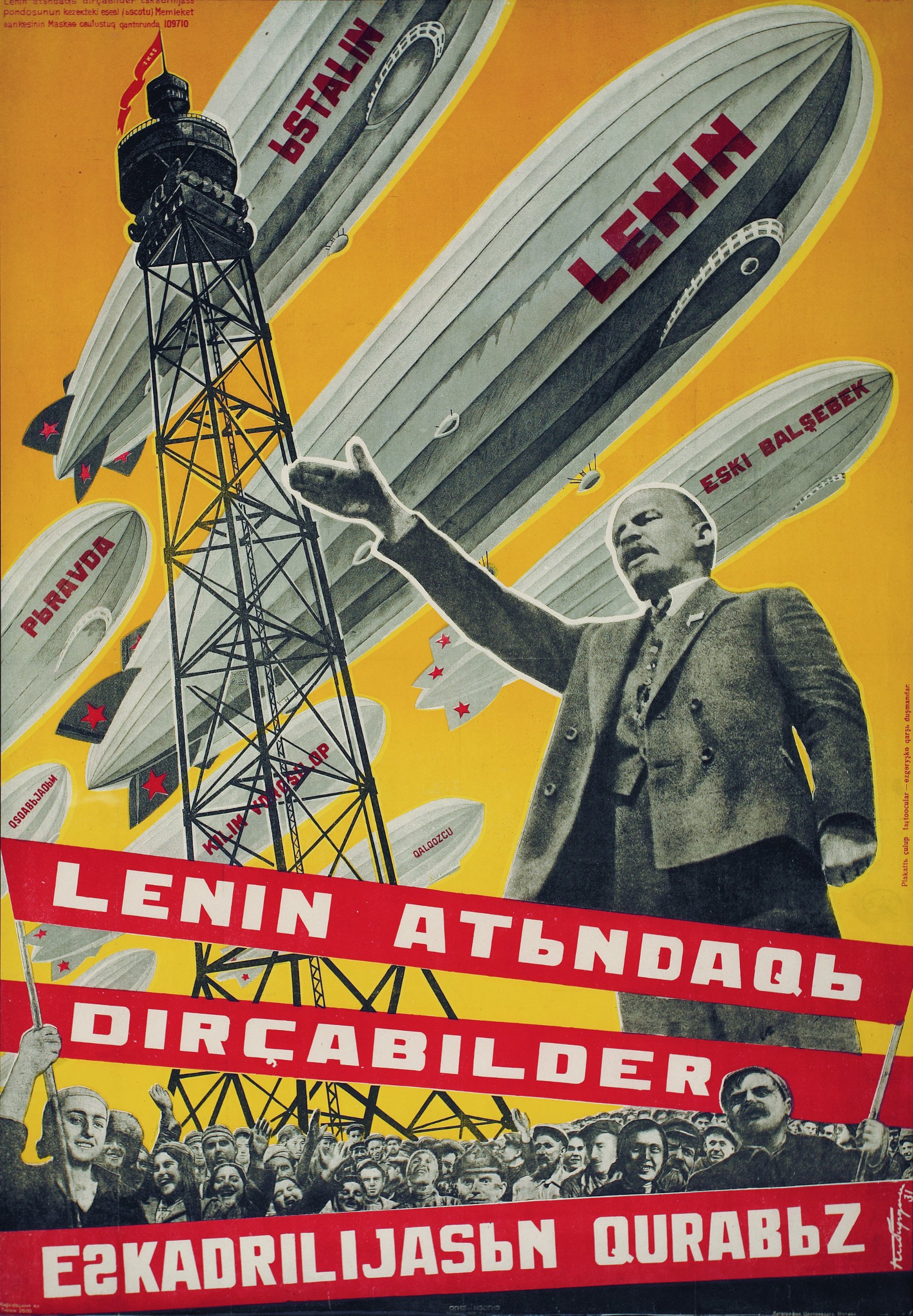
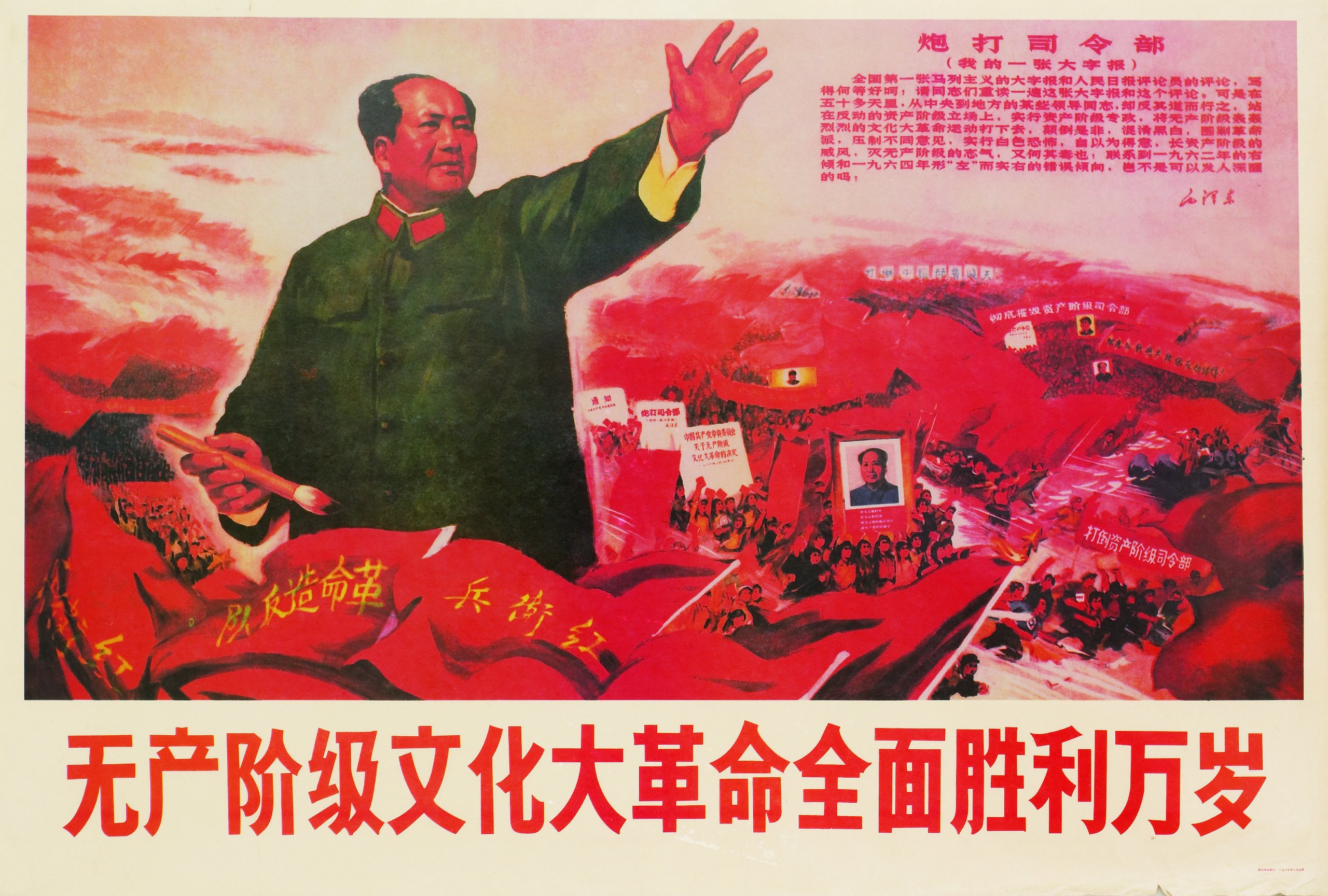
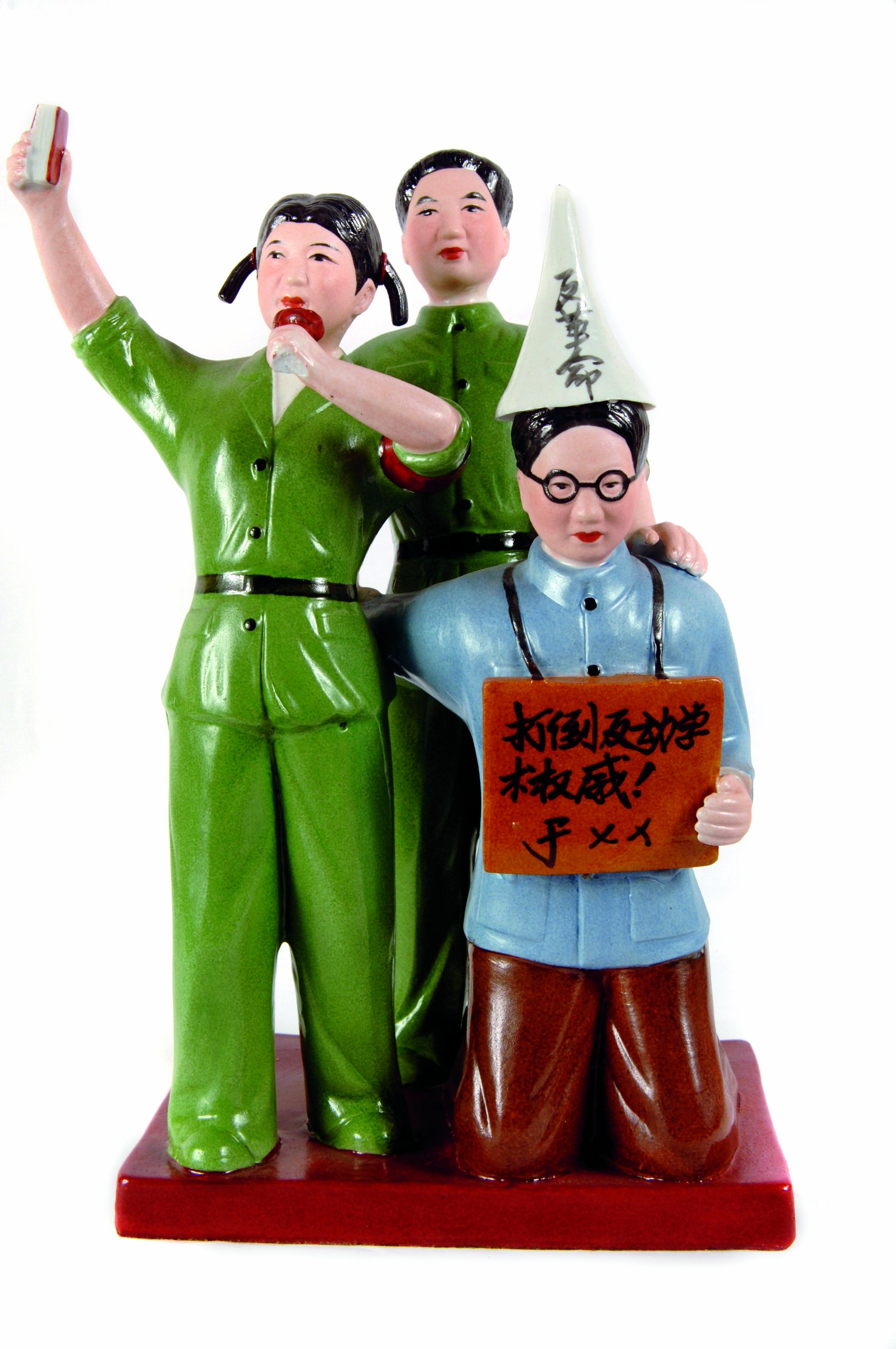
A reasonable introduction to the way four totalitarian governments presented their public face. The book joins a slowly expanding library of titles dealing with State graphics in China, Germany, Italy and the Soviet Union. Steve Heller had an earlier look at Germany with his 2000 published book 'The Swastika: Symbol beyond redemption' and some of that is probably included in these pages, Prestel and Tashen have both published titles covering East German, North Korean and Chinese propaganda posters.Of the four countries surveyed maybe the odd one out is Italy, the images in the book don't seem to have any distinctive feel about them, perhaps Mussolini was content to have his face everywhere and that was enough. So completely different to the Nazi way of presenting their leader and political culture. Pages fifty-two and fifty-three show a 1938 graphics manual published by the German Labor Front showing the correct types to use: Fractur; Rotunda; Futura. Rotunda in particular seems the type of choice in so much printed matter throughout the German chapter.The Soviet Union is the clear winner for eye-catching persuasion. The 1917 revolution swept away existing design styles and new European art 'isms' influenced several designers to start afresh with bold graphics and especially photomontages. Alexander Rodchenko, El Lissitzky and Varvara Stepanova produced posters and photobooks that still look exciting today. Photography was an important part of Soviet propaganda but this didn't seem to influence the revolution in communist China where paintings inspired the masses, paintings and illustrations were part of their culture for centuries. Chairman Mao, peasants and the military were always shown striding confidently into the future (with or without Mao's Little Red Book).Most of the images are reproductions of printed matter: posters; book covers (and some inside spreads from illustrative ones) newspapers; magazines; postcards and more. Non-printed matter includes badges, paintings and statues. There are several interesting whole page photos, rather wasted because they are just used to carry smaller images of print material. Though the book was published by Phaidon it was designed by a New York company so avoids the usual tiny text and plenty of empty page space that is typical of their titles.
M**S
dictators and graphic design
This is a great book that any graphic designer or history lover should have. It tells you how Hitler, Mussolini, Lenin and the chinese leaders were capable to move and brainwash the population of their respective countries by using the propaganda.
M**O
Amazing!! Ten stars!
The book it's a jewel itself!, an historic journey through totalitarian propaganda.Must say that Pheidon books are all remarkables, the quality it's brilliant. Maybe the best book i own.
N**I
Five Stars
Amazing book!
A**R
Five Stars
Check this out for sure!
A**R
Five Stars
Good
J**L
Difficult subject, unknown documents, great published
Great book, good price, fast delivery
B**V
OK
OK
G**O
Stimolante e geniale
Un gran bel libro raccolta di esempi e analisi della comunicazione dei 4 grandi regimi dittatoriali della storia. Innanzitutto una grande idea: da uomo di sinistra, trovo molto stimolante mettere a confronto i temi, le strategie, l'immaginario nazi-fascista con quelli comunisti, permettendo di coglierne le diferenze sostanziali e le evidenti similitudini. Il libro è poi pieno di immagini interessanti e abbastanza ricercate. Se devo fare un appunto, mi spiace un po' non vedere nulla dell'architettura, strumento principe (assieme alla grafica) e paradossalmente a tratti magnifico, del branding dei peggiori regimi.
M**E
Heil iron fist !
Amis graphistes à l'esprit totalitaire, ce livre sera votre Graal. Fan ou membre de Nsk, tu y trouvera ton inspiration.
R**N
The look of total control
A reasonable introduction to the way four totalitarian governments presented their public face. The book joins a slowly expanding library of titles dealing with State graphics in China, Germany, Italy and the Soviet Union. Steve Heller had an earlier look at Germany with his 2000 published book 'The Swastika: Symbol beyond redemption' and some of that is probably included in these pages, Prestel and Tashen have both published titles covering East German, North Korean and Chinese propaganda posters.Of the four countries surveyed maybe the odd one out is Italy, the images in the book don't seem to have any distinctive feel about them, perhaps Mussolini was content to have his face everywhere and that was enough. So completely different to the Nazi way of presenting their leader and political culture. Pages fifty-two and fifty-three show a 1938 graphics manual published by the German Labor Front showing the correct types to use: Fractur; Rotunda; Futura. Rotunda in particular seems the type of choice in so much printed matter throughout the German chapter.The Soviet Union is the clear winner for eye-catching persuasion. The 1917 revolution swept away existing design styles and new European art 'isms' influenced several designers to start afresh with bold graphics and especially photomontages. Alexander Rodchenko, El Lissitzky and Varvara Stepanova produced posters and photobooks that still look exciting today. Photography was an important part of Soviet propaganda but this didn't seem to influence the revolution in communist China where paintings inspired the masses, paintings and illustrations were part of their culture for centuries. Chairman Mao, peasants and the military were always shown striding confidently into the future (with or without Mao's Little Red Book).Most of the images are reproductions of printed matter: posters; book covers (and some inside spreads from illustrative ones) newspapers; magazines; postcards and more. Non-printed matter includes badges, paintings and statues. There are several interesting whole page photos, rather wasted because they are just used to carry smaller images of print material. Though the book was published by Phaidon it was designed by a New York company so avoids the usual tiny text and plenty of empty page space that is typical of their titles.
P**M
Good reference book
Interesting book. Focuses solely on graphic design of the 4 most influential totalitarian regime brand identities. Easy to read, lots of pictures. A good starting point for research.
Trustpilot
1 month ago
1 day ago